4046
So what about this number? Well, that is how many days this Google Note named 5 common typographic mistakes to avoid
has been sitting in my notes folder. I used to use Google Notes to draft blog posts and this one is probably the oldest. I was half way done with this post before it went on a 11-year hiatus. I cannot remember why I stopped but who cares? Because now I am going to finish this.
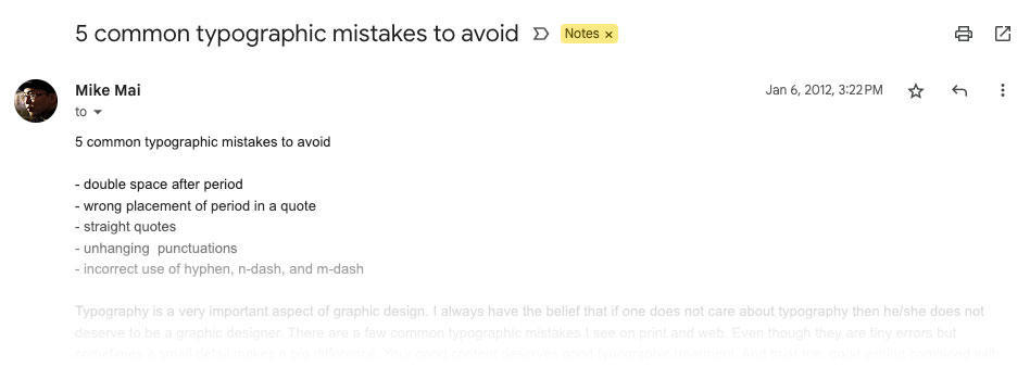
Picture or it didn’t happen
As you can see, this note was created on Jan 6, 2012.
I am really passionate about typography and it bugs me when people do it wrong
. That is why I had the idea of writing a blog post to educate others. Last month I looked back at this unfinished draft and thought this is actually pretty good, and I can make it better.
Good ideas never die
So what would the 2023 me do with this idea? I would not write a blog post about it, that is for sure. You thought this blog post is gonna be that, didn’t you? Nope. The blog format seemed too much. These should be quick tips that are easy for anyone to digest, and there should be more than 5!
And so a micro-site was born.
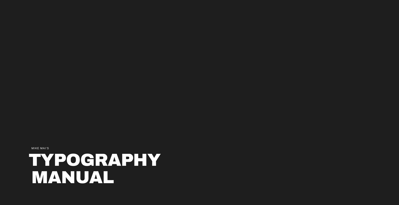
Mike Mai’s Typography Manual
A set of rules that will improve your typography 10x.
I first created it on CodePen on February 3, 2023 and it got featured in its popular newsletter. The pen has received over 7,000 views and more than 300 likes. I did not expect the attention it got. I am very happy that I finally got this out there and hopefully more websites will improve their typography. Text doesn’t have to be boring. It can be beautiful. You can read this manual on my website or CodePen.
Don’t throw away good ideas, y’all.